The First Time I Tried ChatGPT Images 2.0, I Realized…
Published:
Source: Introducing ChatGPT Images 2.0, OpenAI
The Feeling That Changed
The first time I tried ChatGPT Images 2.0, the thing that surprised me was not simply that the images looked better.
They did look better. But that was not the part that changed how I thought about it.
The more interesting feeling was that image generation had started to behave less like a magic box and more like a visual workflow. I was not just writing one prompt, waiting for one result, and deciding whether the model had succeeded or failed. I was having a back-and-forth with a system that could understand a visual goal, make a reasonable first attempt, accept corrections, and move closer to something usable.
The Old Problem: Pretty, But Hard To Trust
For a long time, my relationship with image models was basically this: they were impressive, but unreliable. I could use them for inspiration, mood boards, strange concept art, or a quick visual joke. But whenever I needed something close to a real design asset, the experience became fragile.
The image might look good at a glance, but the details would fall apart. Text would become decorative noise. A poster title would have extra letters. A sign would look almost readable, which somehow made it worse. If I asked for a product mockup, the object might be beautiful, but the label would be nonsense. If I asked for one specific edit, the model might redraw everything around it.
The frustrating part was not that the model could not generate pretty images. It could. The frustrating part was that it was hard to trust.
There is a big difference between “this image is impressive” and “I can use this image in a workflow.” The second one requires more than aesthetic quality. It requires readable text, reliable edits, consistency, and enough control that a user can move from an idea toward a deliverable without starting over every time.
What Felt Different This Time
After playing with it for a while, I do not think the improvement is one single thing. It is a cluster of smaller changes that add up to a different experience:
- text is closer to real design use
- editing feels iterative instead of one-shot
- consistency across related images is more believable
- the output feels more production-shaped
Text Is No Longer Just Texture
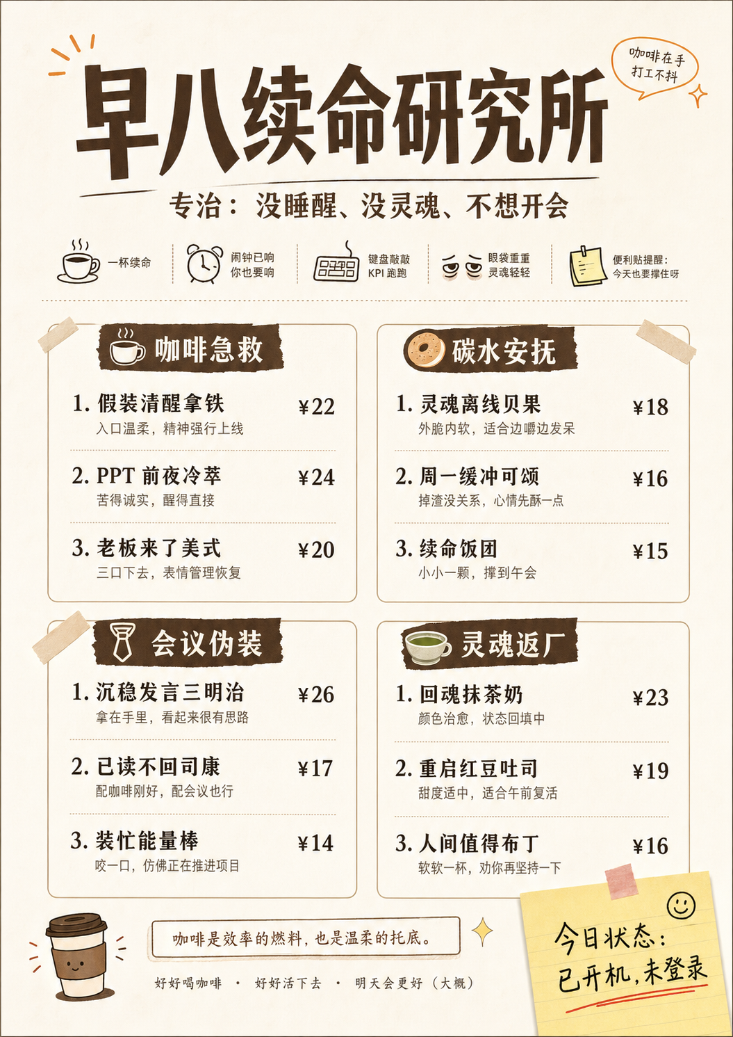
Text has always been one of the easiest ways to tell whether an image model is actually useful for real design tasks. A fantasy landscape can hide many errors. A poster cannot. A slide cover cannot. A product label cannot. A menu, an infographic, a UI mockup, or an ad layout cannot. In those cases, letters are not decoration. They are part of the object.
With older image models, text often felt like a trap. The model understood that something should look like text, but not that the text had to be text. The output felt like a sketch of a design rather than a design draft.
ChatGPT Images 2.0 feels meaningfully different here. It is not perfect, and I would still check every generated word before using it anywhere serious. But the gap between “pretty but unusable” and “rough draft I can actually evaluate” feels much smaller. Dense text, poster titles, layout-heavy images, notes, and multilingual scenes are no longer automatically doomed.
Iteration Matters More Than One Perfect Prompt
This may be the more important change. Image generation used to feel too much like prompt gambling. You wrote a prompt, got a result, then rewrote the prompt and hoped the next result would be closer. If the image was 80 percent right, that was almost annoying, because fixing the last 20 percent often meant risking the whole image.
The new experience feels closer to working with a designer or art director, even if that comparison is still imperfect. You can say: keep this composition, change the headline, make the background cleaner, adjust the color palette, remove this object, make the product larger, keep the style but generate a vertical version.
The important part is not that every edit lands perfectly. The important part is that the interface encourages revision instead of replacement.
That changes how I prompt. When a model is a one-shot generator, I try to pack everything into the first prompt. But when the model supports a real editing loop, the first prompt can be a direction, not a final contract. I can let the image appear, react to it, and then refine it.
Consistency Turns Images Into Assets
One image is easy to admire. A set of related images is much harder to make useful. If I am making a campaign, a carousel, a product series, or a sequence of scenes, I do not only care whether each image looks good. I care whether they belong together.
ChatGPT Images 2.0 seems better suited for this kind of multi-image thinking. It feels less like asking for isolated pictures and more like asking for a visual system. That does not mean it solves brand consistency or production art direction. It does not. But it moves the model closer to the kind of asset generation actual teams need: variations, adaptations, sequences, and reusable visual directions.
It Feels More Production-Shaped
I am careful with the word “production” because generated images still need review, taste, and often post-processing. But there is a difference between a toy and a tool. A toy produces surprising outputs. A tool helps you finish a job.
The practical improvements around format, size, quality, reference images, and editing make the model feel more like something that can participate in real work. I can imagine using it for ad concepts, e-commerce mockups, social posts, slide covers, internal prototypes, blog visuals, thumbnails, and early creative exploration.
Not as a final authority, but as a fast collaborator in the messy middle between idea and finished asset.
Still Not Magic
The biggest limitation is that the output is still mostly an image, not an editable design file. If I want to move a text box by four pixels, change a font weight, adjust a layout grid, or hand off layered assets to a designer, I still want tools like Figma, Photoshop, Illustrator, or some structured design environment. A generated PNG is not the same thing as a production design file.
Language is another limitation. English text may be better, but multilingual text can still be uneven. Even when the words are correct, typography is a separate skill. Good text rendering is not the same as good graphic design.
But those limitations do not make the progress less interesting. They make the direction clearer.
My Takeaway
The important shift is not that ChatGPT Images 2.0 is suddenly the final stop for visual production. It is that image generation is starting to become an interactive workspace.
It is moving from “make me a picture” toward “help me develop this visual idea.”
After trying it, my conclusion is simple: the model is not merely getting better at drawing.
It is getting better at staying with the user through the process of making something visual.
A Few Test Outputs
Here are a few outputs I used to think through the points above. I am not including them as final polished design work. Each one is here because it shows a different part of the workflow that felt meaningfully different.
One thing I wanted to test was what happens when image generation is connected to web search. Instead of generating only from a static prompt, the model can use external context to make the visual more grounded. This matters for images that depend on current events, products, places, or facts that may not be fully contained in the prompt.
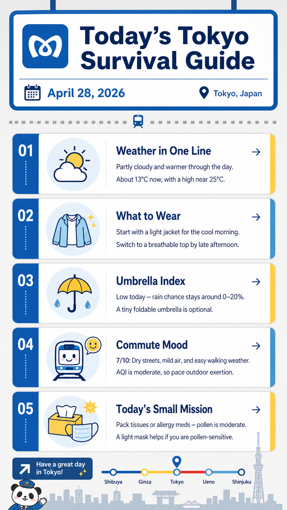
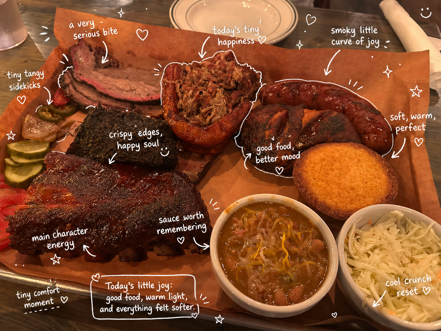
I also wanted to see how well it could follow a specific visual direction. The interesting part is not only whether the image looks good, but whether the model can hold onto composition, mood, layout, and the feeling of a particular kind of image. That is where it starts to feel closer to design iteration than generic image generation.
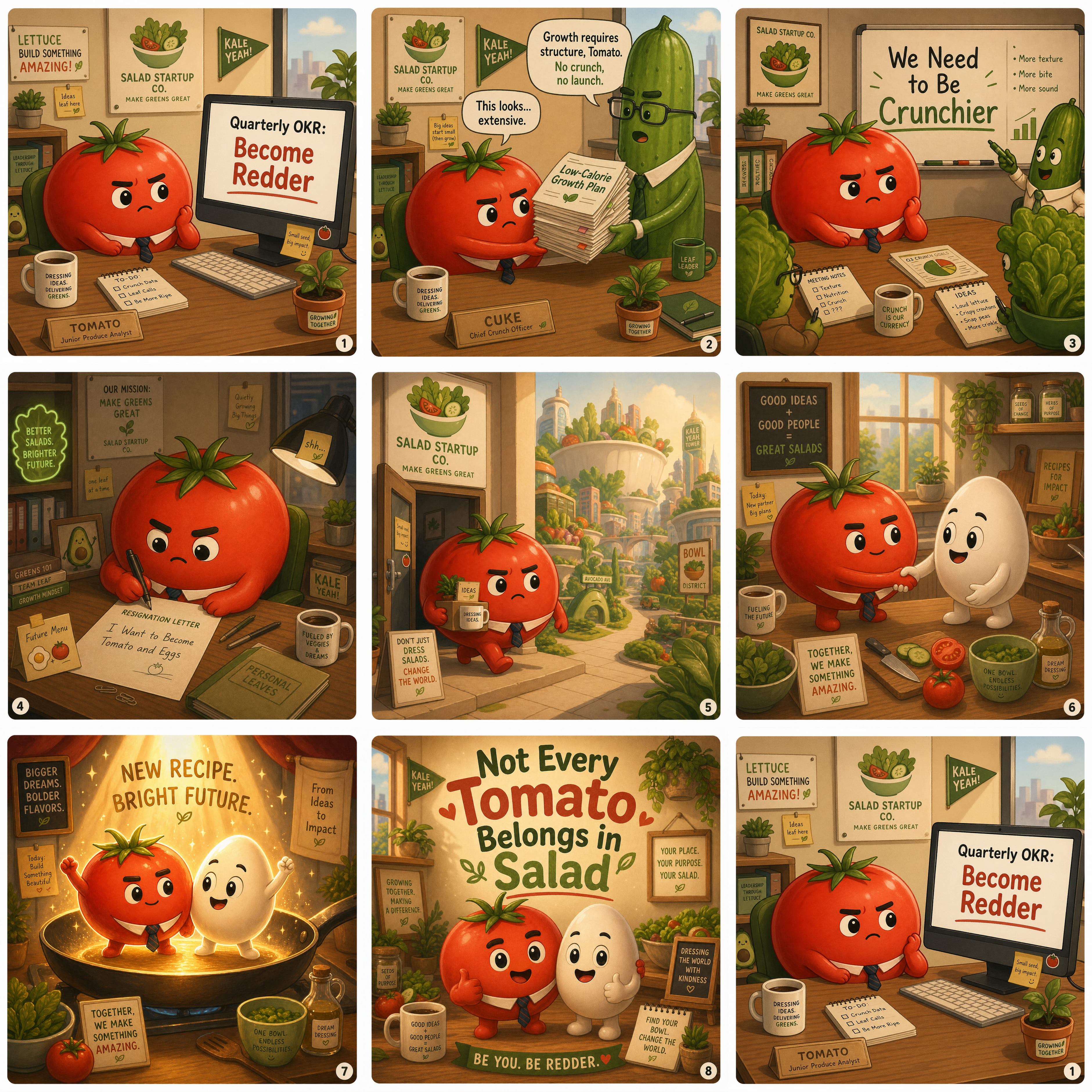
Consistency was another thing I cared about. For real use, one nice image is often not enough. You may need several images that feel like they belong to the same campaign, product line, or story world. This example points to that shift from isolated image generation toward reusable visual assets.
The text-heavy example is the one I would inspect most carefully, because text is where image models historically failed in very obvious ways. But it is also the example that best shows why the update feels different: the model is not only drawing letters, it is trying to preserve readable meaning across layout and language.